Pages

Showing posts with label drawings. Show all posts

Sunday, 16 March 2014

New month - new art journal

Hi everyone,

It has been quiet on the blog front but I have been busy. As Spring is starting to bloom and the evenings are becoming lighter, I have started a new art journal and painted several new canvases this month.

R and I also decided to start an Instagram account called #andyandrachael where we try to post daily photographs of projects and things that inspire us. Please feel free to check it out if you are interested. We would love to see you there...

Here are a few photographs of the journal so far:


As you all know, nature is a big source of inspiration of mine and this has crept inside the journal


I was really inspired when I revisited the paintings I created on Flora Bowley's ecourse Bloom True last year and this double page spread reflects that inspiration.


This source of inspiration continued further last weekend when I added to some new canvases  It felt brilliant to be working on canvas again and to watch how they are developing (as well as getting messy!). Lucky for me, my wife is very supportive when I am in the painting zone!!! 


Hope that Spring is inspiring you too.

Andy

Thursday, 15 August 2013

Art that Sells - weeks 4 and 5

Hi Everybody

I hope that this posting finds you all well. It has been great to have the time to create so many blog posts. The summer holidays are racing by.

As promised, here are the two final assignments of the Lilla Rogers Make Art That Sells e-course. 

In week 4, we were asked to produce a piece of wall art. It  had to have very specific colours and the starter activity was to gather collections that demonstrated those colour combinations. This was a fun activity.


Over the course of that week, I produced my canvas using these colours. This was a definite challenge for me. I have to admit using these colours together was not a natural thing for me, though I did warm to them in the end. I also used stamping techniques on the canvas to create texture. This was also a first for me but I was pleased with the end results.


The only thing that I would change about this painting is the text. I don't usually use text on an image, as I like people to look at my paintings and make up their own minds about its subject matter. On review, I am going to remove the text and I will post the results at a later date. It was really interesting to look into the wall art market, and to think about the type and styles of work that people will buy to place in frames and hang.

As a side line to the painting, I created three collages. Originally they were going to be part of the painting and although I didn't use them in the end, I do like them and may make some more for another project. With art, nothing is ever wasted!


In week 5, the last week of the course, we were asked to create a 'lush' design that could be used on a range of gifts. The starter activity was to create images of our personal collections. I think I have mentioned before on this blog that I have a big passion for fossils, minerals and natural forms, so I produced drawings and photographs from my collection.


At this stage, I wasn't quite sure how to interpret a 'lush' design but I then came up with the idea of inserting my fossil drawings into images of bottles I have also collected and this created a busy, colourful design. To do this, I had to use Photoshop and Illustrator, the effect is certainly very different than my normal use of drawing and paint.

Here's a section of my final design. 


It was great to do something different and fascinating to read the enormous amount of information provided by Lilla. 

In respect of the course I found it very challenging, as several of the assignments were outside of my normal area of expertise, but I enjoyed being stretched out of my comfort zone. I am now able to view art in a much larger picture seeing it applied to the variety of goods for which Lilla Rogers is an agent. If any of you want to make art to sell, I cannot recommend this course enough. Each area of the market place is thoroughly covered by examples, interviews and contacts. Mind-blowing information from which I have gained so much. Thanks to Lilla and Beth for this amazing course.

I hope that you have found this interesting. I will post again soon with the latest developments from the Man Cave.

Andy


Wednesday, 26 June 2013

Week 3 of Making Art that Sells

Hi everyone

Last week, I had an enormous amount of fun working on an assignment where we were given a task to illustrate Hans Christian Andersens, 'The Snail and the Rose Tree'. This is a short story, with the moral story-line: never give up on personal achievement. How relevant! It was a great challenge as I have always wanted to illustrate a book.


This is my final piece. Everything was hand drawn using pens, pencils, watercolours, or painted with acrylics and then scanned and collated in Illustrator.

At the beginning of the process, I developed the two main characters, and I hope you can see the amount of pleasure I had with this assignment through the amount of drawings and sketches I made that covered the kitchen table... and floor? It was an organised mess!

I started the drawing process by looking at the snail and trying to get his character right. He was the hardest for me because I wanted to make him look  'cute' but not loose the shape and character of a normal snail. Below are some of my sketches that did not make the cut.


I have to admit the Blue snail almost made it to the front cover. I feel he is a very jolly little fellow. But, this was before I had read the storyline. He looks too happy and needs to be more grumpy.


Next are the sketches for the border. When we were asked what was our favourite children's book, I immediately knew mine from childhood. The Riverbank Rumpus by Simon Joyner. The detail and quirky little characters really inspired the way my cover developed. The idea for the border was that in the story, the garden is surrounded by hazel bushes, so these sketches are what created the edging on the book cover and they would be inhabited by some little characters that might not be seen at first glance. Look out, there are four of them hiding around.
                                                                                                   

I hand painted my background using techniques I had developed on the Flora Bowley course (which you can see in a previous post here) and then the final pieces were: the writing (which is a whole post in itself) and the rose tree with the bushy eyebrows. He was the one I had the most fun designing and I hope to develop him further in future projects.


I hope I achieved the rose tree character to look thoughtful and wise but not too scary for a children's book. I love how his character evolved from bushy eyebrows to hairy ears. He makes me smile every time I look at him! I really had tremendous fun in creating this book cover and could visualize a whole book. Maybe one day? Now I must look to this week challenge of orange and green... that I will post about next time.  

Last weeks challenge, I feel, has really brought out more of my personality in the use of different art mediums, rather than just through ink and pen. Thank you Lilla Rogers. Your amazing input and encouragement is bringing out the best in all artists on your course. I cannot speak highly enough about Make Art That Sells. This course is really showing me that by using stepping stones I can achieve my goals.    


I can't wait to have a spare moment to catch up with my fellow bloggers. I have slightly got behind. Sorry.

Until the next time, have a good week. 

Andy

Monday, 17 June 2013

Making Art That Sell

Hello everybody

I have been very fortunate to find myself on the e-course 'Make Art that Sells' run by Lilla Rogers, who is an Art Agent Extraordinaire. 

Last week was week two and with the fantastic support of my wife, I have managed to find the time to complete two great assignments.

The course is about helping you to develop your work ready to use in a commercial market.


The first assignment was to develop a vintage kitchen style fabric


I used my own photographs and drawings to help influence the final outcome.


I have not drawn like this for a long time so it was a great exercise.

Assignment Two was to design a set of plates. This was a bit more difficult, but here is the final result.


I would love to know what you think? 

Time for me to start Rinda's 2013 scavenger hunt and the third class assignment commences this week. All I know is that it is book illustration; can't wait!

Busy times ahead at school also as the end of term exams and ofsted (again) are looming.

Take care and I promise to be back soon with a glimpse of this week's assignment about which I am very excited. Can you tell? 

Andy

Saturday, 4 May 2013

How to Create a Jellyfish in Five Steps


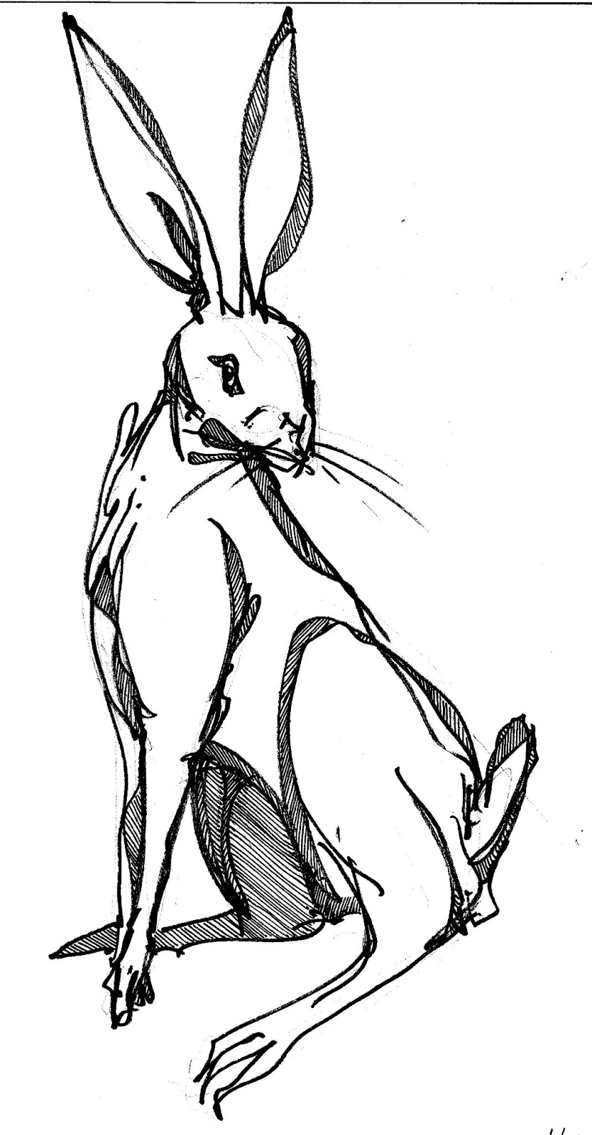
Hi everyone, can't believe it is May already. April seems to have passed in a flash...

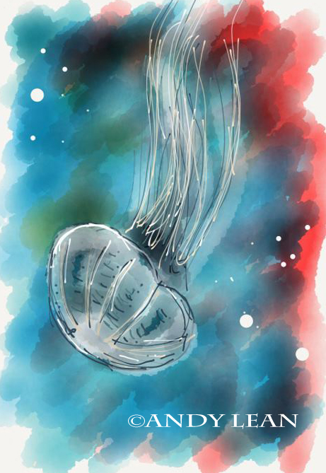
Thank you so much for the positive feed back from my last post. I had hoped to film the process of creating an image to show you all, and will definitely do so some time soon. Instead, I will try to explain the steps I used and forgive me if I do not use the correct terminology.

In response to MiriamRinda and Alexa's questions, my friend had a Griffin Stylus. It was the first time I had used one (it was a day for firsts, considering I had only just switched the iPad on) and then immediately proceeded to open up Paper 53.


STEP 1: My first layer on the 'Page' was to give the background a wash with colour (in this case a yellow ochre) using the paintbrush tool. Once that was complete, I gave another layer of darker colours (grey and black). I tried to keep it light in touch as I didn't want it to look too dark in appearance.

STEP 2: With the background complete, I started to draw the jelly fish using the white colour and the paintbrush tool. This was to affect the appearance of a 'glow' around the jellyfish. If I had more time, I would have loved to have investigated if I could make the marks bigger or smaller.

STEP 3: Now it was time to draw. I started with the dark grey that is in the automatic paint palette and used the pen tool to draw free hand the basic features of the jelly fish. Once that was done, I then changed to the slightly lighter shade of grey and drew over the top of that. It does not matter that the colours overlapped. I personally think it created more character. 

STEP 4: For the next layer of this particular image, I then used the same (or close to) ochre colour as the background and drew over the top again but this time, I only drew into the shadowy areas. I feel this gave a transparency to the jellyfish.

Step 5: To the underneath of the jellyfish, I added some darker shadows to give it some depth, and I also gave a quick 'swish' down the tentacles. After that, I added some final details. I went back to the lighter grey and used this on the top sections of the jellyfish and to where the light would hit it, I added pure white.


I hope that was helpful? I found myself treating Paper 53 like a sketchbook more and more over the time I was able to use it, and it was so refreshing to paint and draw without the necessity of having to get out all of my art equipment.

I did not just stop at jellyfish. I had a go at lichen, mushrooms and even Chillies made a come back, all using the same process I have included above.


The frog and mushrooms were loosely based on a photograph (I think!) that I saw in an old National Geographic magazine.


Using the layering and drawing techniques, I hope this is a good rendition of lichen?

I am trying to talk my friend into lending the iPad to me again. I really want to try some other drawing programmes and I would love to do either a video or a series of photographs of the process. I will let you know how that goes...


Half term is fast approaching, so I may get an opportunity to spend some more time using the drawing programme. It is addictive!

In the meantime, enjoy your Bank holiday weekend if you are in the UK and a very happy National Scrapbooking Day to all you happy scrappers out there.

Andy.

Tuesday, 2 April 2013

Of Jelly Fish and iPads...

Hello to you all!


Life has been crazy/busy at school this past month, leaving me with not a lot of free time for my own art work. Most evenings this term have been spent marking and writing up new schemes of work. Recently though, I had the good fortune to use a friend's iPad and would like to share with you some drawings and paintings I have done using the programme Paper 53.


I was glad of the opportunity to try out an iPad with a drawing programme before committing to getting one of my own. I have always been fascinated by technology but fearful of the time it would take to learn how to use it properly.


However, the programme was really easy to use and it took hardly any time to to create these images I am showing you. I really enjoyed the ease and simplicity of Paper 53. Each image took me about five minutes to draw. How cool is that!


The colours blend together so vibrantly and I am really looking forward to experimenting more over the Easter holidays. I am a definite iPad convert. I will post some more drawings very soon.

In the meantime, I trust you had a wonderful Easter and I hope to catch up with some blog reading and commenting soon. I have missed seeing what you have all been creating. 

Andy.


Wednesday, 20 February 2013

Sweet Challenge last Sunday!


Hi Everyone

It is finally half term and I can get creative once more. After a number of birthdays (including my Dads 70th!) and the usual paperwork marking are now out of the way, it's nice to have time to create, whether it is by drawing, painting or... Baking!


My wife and I raided our cook books to find something different. My wife decided on cheese and onion tear and share bread (courtesy of Paul Hollywood).


I have say it was yummy with Tomato soup

My contribution to the baking weekend - a favourite - Iced buns! Here is my first ever attempt (courtesy of Paul Hollywood). I will not admit to being the best baker in the world, they are a bit rough around the edges, but I am looking forward to trying one in front of the TV later with a cup of Tea. 


The Sketchbook Challenge theme this month is 'sweets' which not only satisfies my sweet tooth, but it has been a lot of fun to draw my own baked, not shop bought, buns. 

Here are a few of my sketches of the iced buns and a few creative ones too. The materials I used were a sketchbook, black sharpie pen, and colour drawing pencils (to blend colours). Enjoy!


Mmmm, what can I try next to bake?

I will be back soon with another arty painting post, or maybe details of an inspiring walk. We are lucky to have some warm sunshine today. 

I hope to catch up with my fellow bloggers this week. Missed seeing what everyone is creating. 

Enjoy your week, Andy